A Figma S maps to a reusable HubSpot section template. Modules live inside the section and control editable content.
Final naming strategy
Use the object type, stable family number, mnemonic abbreviation, separator, and full searchable name. Shared modules retain their own low-number utility family.
S120MG identifies a section, family 120, and Media Grid even before the full label is visible.
Use Media Grid, not Platform Capabilities; use Alternating Media, not Use Cases.
The full label follows the pipe: S120MG | Media Grid. IDs never replace the human-readable name.
A repeated card inside one module is a nested UI component, not a standalone HubSpot picker module.
Use -A/-B only when section structure materially changes, not when content or item count changes.
T010DP | Detail PageT template · 010 stable family · DP Detail Page mnemonic.S100H | HeroS reusable HubSpot section template. Layout type is configuration or an approved suffix variant.M010SH | Section HeadingM shared editable HubSpot module reused by multiple section families.M120MG | Media GridA section-family module uses the same family number and mnemonic when it represents the complete editable block.U120MC | Media CardU nested React component or repeater item hidden from the general module picker.S175CB-B | CTA Banner — VisualSuffixes are reserved for approved structural variants, not content count or background color.Deprecated aliases: generic names, content-specific names, duplicate “(1)” filenames, inconsistent M/S usage, and encoding-corrupted names such as
S-СH-01 remain searchable aliases only. They should not be used for new Figma frames, HubSpot labels, folders, or Jira tasks.Mnemonic abbreviation dictionary
Abbreviations are deliberately short, uppercase, and attached to the family number. The full text label remains the source of truth for human understanding and search.
| Code | Meaning |
|---|---|
DP | Detail Page |
H | Hero |
HC | Hero Content |
HV | Hero Visual |
SH | Section Heading |
MS | Metrics Strip |
MC | Metric Card or Media Card — resolved by family number and full label |
MG | Media Grid |
FG | Feature Grid |
FC | Feature Card |
PJ | Pricing Journey |
JC | Journey Card |
AM | Alternating Media |
MR | Media Row |
AG | Asymmetric Grid |
CC | Content Card |
SP | Social Proof |
RS | Review Strip |
RB | Review Badge |
LC | Logo Cloud |
AC | Award Card |
CB | CTA Banner |
VB | Visual Board |
FA | FAQ Accordion |
FI | FAQ Item |
HubSpot implementation hierarchy
The section and module layers are both retained, even when a section contains only one primary module.
The section governs background, width, rows, columns, spacing, responsive order, and approved module placement.
The module owns editable fields, repeaters, images, links, rich text, and behavior. Internal-only modules can be hidden from the picker.
Cards and items rendered by a repeater are nested React components. Editors manage them through the parent module.
Content managers should primarily use Add section, then edit the contained modules without rebuilding the layout manually.
Template family
The attached Industry page becomes an approved instance of a more reusable detail-page template.
Template family T010DP
T010DP | Detail Page
Reusable long-form page template for industry, solution, persona, use-case, and product-detail narratives. Global header and footer remain inherited from the base layout; approved sections are inserted inside the drag-and-drop area.
Figma
T010DP / Detail Page / DesktopHubSpot
T010DP | Detail PageTemplate
templates/t010dp-detail-page.hubl.htmlReact
components/pages/T010DPDetailPage
Industry pages
Solution pages
Persona pages
Use-case pages
Product narratives
Live T010DP composition sample
Reusable section registry
Each card below documents the agreed registry entry and renders compact previews from the real HubSpot section partials and React modules instead of screenshot assets.
HubSpot section family S100H
S100H | Hero
Designer / legacy aliases:
S-H-01, S-H-02; S100H | HeroGeneral hero section family supporting split, centered, text-only, and visual-led compositions without encoding one layout into the canonical name.
Final decision
Hero is the reusable family. Split composition presentation is a controlled layout option or structural variant. The optional visual is named Hero Visual because it may contain a dashboard, illustration, image, animation, or video—not only a product screenshot.
S100H | HeroAdd sectionContained HubSpot modules
M100HC | Hero ContentEyebrow, heading, description, heading, description, optional primary CTA, alignment, and content width.M100HV | Hero VisualEditable image or dashboard visual with alt text and optimized responsive output.
Figma
S100H / Hero / Base; optional layout variantsHubSpot
sections/S100H-Hero.hubl.htmlCodebase
modules/M100HCHeroContent; modules/M100HVHeroVisualSearch
hero, split hero, centered hero, visual hero, banner, CTASplit compositionHero visual moduleResponsive stackingCTA enabled/disabledResponsive stack order
HubSpot section family S110MS
S110MS | Metrics Strip
Designer / legacy aliases:
M-N01, M-N01-2, M-N01-3, M-N01-4; M110ML | Metrics ListSingle-row proof or KPI section containing repeatable metric cards and responsive stacking behavior.
Final decision
The section and parent module use the same clear name. Each repeatable unit is consistently classified as a Metric Card, while two to five cards remain configuration rather than separate variants.
S110MS | Metrics StripAdd sectionContained HubSpot modules
M110MS | Metrics StripRepeatable metrics collection controlling columns, dividers, alignment, responsive wrapping, and optional card icons.
Nested React UI components / repeater items
U110MC | Metric CardMetric value, stat label, optional qualifier, description, and optional icon.
Figma
S110MS / Metrics Strip / BaseHubSpot
sections/S110MS-Metrics-Strip.hubl.htmlCodebase
modules/M110MSMetricsStrip; components/U110MCMetricCardSearch
metrics strip, KPI, stats, numbers, proof, metric cards2–5 metric cardsOptional iconDividers on/offCenter/left alignment
HubSpot section family S120MG
S120MG | Media Grid
Designer / legacy aliases:
S-D-01, S-D-02, D02; M-D-01, M-D-03, M-D-04General image-led card grid for capabilities, services, product areas, categories, benefits, or related content.
Final decision
Page-specific wording such as Platform Capabilities is removed. One shared Section Heading module provides the title and description, while the Media Grid module owns the repeatable cards.
S120MG | Media GridAdd sectionContained HubSpot modules
M010SH | Section HeadingShared heading module: optional eyebrow, title, description, heading level, alignment, and content width.M120MG | Media GridRepeatable media cards, column count, card alignment, image ratio, and responsive behavior.
Nested React UI components / repeater items
U120MC | Media CardImage or media, title, description, optional text link, and optional CTA.
Figma
S120MG / Media Grid / BaseHubSpot
sections/S120MG-Media-Grid.hubl.htmlCodebase
modules/M010SHSectionHeading; modules/M120MGMediaGrid; components/U120MCMediaCardSearch
media grid, media cards, image cards, capabilities, services, categories1–6 cardsOptional card CTAOptional rich-text linkOptimized media images
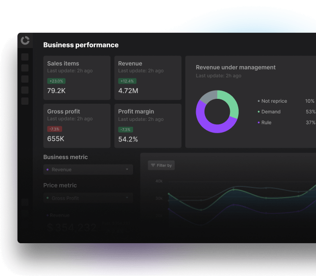
Contextual demand-based pricing
Model how shoppers respond to price changes using elasticity, category roles, and market context across grocery assortments.
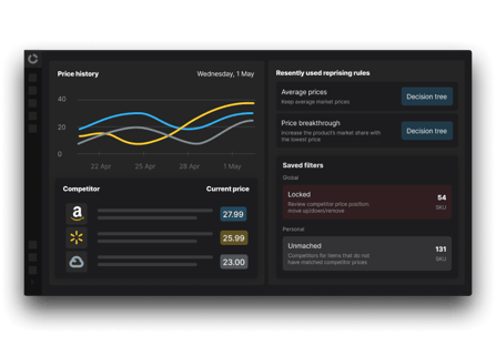
Balanced pricing system
Coordinate price architecture, margin targets, and competitor moves inside one pricing decision layer.
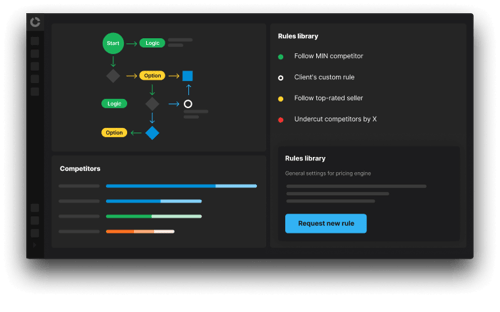
Purpose-built AI retail pricing
Deploy pricing workflows designed for enterprise grocery teams that need explainable AI and measurable business outcomes.
Contextual demand-based pricing
Model how shoppers respond to price changes using elasticity, category roles, and market context across retail assortments.
Read more
Balanced pricing system
Coordinate price architecture, margin targets, and competitor moves inside one pricing decision layer.
Read more
Purpose-built AI retail pricing
Deploy explainable pricing workflows designed for enterprise retail teams and measurable business outcomes.
Read more
Contextual demand-based pricing
Model how shoppers respond to price changes using elasticity, category roles, and market context across retail assortments.
Read more
Balanced pricing system
Coordinate price architecture, margin targets, and competitor moves inside one pricing decision layer.
Read more
Purpose-built AI retail pricing
Deploy explainable pricing workflows designed for enterprise retail teams and measurable business outcomes.
Read more
HubSpot section family S130FG-A/B
S130FG-A/B | Feature Grid
Designer / legacy aliases:
S-I-01, S-I-02; M-I-01…M-I-16Icon-led or text-led feature grid for benefits, principles, differentiators, reasons, or service attributes.
Final decision
The card schema is shared. Standard and Extended are approved structural section variants; card count, content length, and optional fields do not create new component families.
S130FG-A/B | Feature GridAdd sectionContained HubSpot modules
M010SH | Section HeadingShared title and description above the grid.M130FG | Feature GridRepeatable features plus a restricted standard/extended layout configuration.
Nested React UI components / repeater items
U130FC | Feature CardOptional icon, eyebrow, title, description, and optional link.
Figma
S130FG-A / Feature Grid / Standard; S130FG-B / Feature Grid / ExtendedHubSpot
sections/S130FG-B-Feature-Grid-Extended.hubl.html; Standard is rendered through the same M130FG configurationCodebase
modules/M130FGFeatureGrid; components/U130FCFeatureCardSearch
feature grid, benefit cards, icon cards, reasons, differentiatorsVariant A: StandardVariant B: ExtendedOptional iconOptional link

KVI MANAGEMENT
Protect products that shape shopper price perception
Manage anchor items separately to keep KVI pricing sharp while the rest carries margin.

PORTFOLIO SEGMENTATION
Group your portfolio the way your margin actually works
Split KVIs, private labels, and perishables into their own optimization groups, so each gets pricing logic built for how it behaves.

PROMO OPTIMIZATION
Run profitable promotions on the right timeline
Test promotions against an incremental-lift baseline to identify which grow volume and which erode margin.
KVI MANAGEMENT
See how private label and national brands perform side by side
Compare private label and national brand pricing across store clusters by predicted revenue, margin, and volume.
PORTFOLIO SEGMENTATION
Balance category roles, targets, and execution windows
Keep pricing logic aligned across categories, stores, and zones while still adapting to how each group performs.

MARKDOWN OPTIMIZATION
Time markdowns for perishables before they become waste
Optimize discount depth and timing with predictive modeling. Set a sales target and let the engine build the markdown wave.
KVI MANAGEMENT
Adapt price perception by cluster, not by broad assumptions
Reflect local willingness to pay through store clusters while keeping price, promo, and markdown strategies consistent.

PREDICTIVE MODELING
Simulate demand, margin, and volume before rollout
Preview the downstream effect of every pricing move before it reaches stores, assortments, and weekly reporting.
Balance competitive and value-based pricing strategies with Competera AI
KVI MANAGEMENT
Protect products that shape shopper price perception
Keep KVI pricing sharp while the rest of the assortment carries margin.
PORTFOLIO
Group your portfolio by pricing role
Give KVIs, private labels, and perishables logic built for how they behave.
PROMOTIONS
Run profitable promotions on the right timeline
Identify promotions that grow volume without eroding margin.
KVI MANAGEMENT
Protect products that shape shopper price perception
Manage anchor items separately to keep KVI pricing sharp while the rest carries margin.
PORTFOLIO SEGMENTATION
Group your portfolio the way your margin actually works
Split KVIs, private labels, and perishables into their own optimization groups, so each gets pricing logic built for how it behaves.
PROMO OPTIMIZATION
Run profitable promotions on the right timeline
Test promotions against an incremental-lift baseline to identify which grow volume and which erode margin.
KVI MANAGEMENT
See how private label and national brands perform side by side
Compare private label and national brand pricing across store clusters by predicted revenue, margin, and volume.
PORTFOLIO SEGMENTATION
Balance category roles, targets, and execution windows
Keep pricing logic aligned across categories, stores, and zones while still adapting to how each group performs.
MARKDOWN OPTIMIZATION
Time markdowns for perishables before they become waste
Optimize discount depth and timing with predictive modeling. Set a sales target and let the engine build the markdown wave.
KVI MANAGEMENT
Adapt price perception by cluster, not by broad assumptions
Reflect local willingness to pay through store clusters while keeping price, promo, and markdown strategies consistent.
PREDICTIVE MODELING
Simulate demand, margin, and volume before rollout
Preview the downstream effect of every pricing move before it reaches stores, assortments, and weekly reporting.
Balance competitive and value-based pricing strategies with Competera AI
HubSpot section family S140PJ
S140PJ | Pricing Journey
Designer / legacy aliases:
S-PJ-01, S-PJ-02; M-PJ-*; S140JS | Journey StepsConnected pricing stages for the Competera pricing journey, maturity model, or related pricing transformation narrative.
Final decision
The current component is specifically designed and implemented for the pricing journey, so the final agreed name remains Pricing Journey. Repeated stages are Journey Cards.
S140PJ | Pricing JourneyAdd sectionContained HubSpot modules
M010SH | Section HeadingShared title and description above the journey.M140PJ | Pricing JourneyOrdered repeatable journey stages, connectors, and responsive orientation.
Nested React UI components / repeater items
U140JC | Journey CardStage icon, title, description, supporting text, and optional link.
Figma
S140PJ / Pricing Journey / BaseHubSpot
sections/S140PJ-Pricing-Journey.hubl.htmlCodebase
modules/M140PJPricingJourney; components/U140JCJourneyCardSearch
pricing journey, pricing maturity, journey cards, stages, roadmapFive-stage desktop rowResponsive wrapping1–5 Journey CardsControlled card accents

Automated data-driven pricing
Turn market data and customer response signals into guided price action.

Unified pricing structure
Manage strategies, roles, and guardrails across stores, clusters, and categories.

Deep learning price optimization
Use AI to continuously improve outcomes as pricing decisions accumulate.

AI price recommendations
Help pricing teams accelerate next-best actions instead of relying on static reports.

Predictive scenario modeling
Simulate the downstream impact of pricing moves before rollout.
Data-driven pricing
Turn market signals into guided price action.
Unified structure
Manage strategies and guardrails across the business.
AI optimization
Improve outcomes as pricing decisions accumulate.
Automated data-driven pricing
Turn market data and customer response signals into guided price action.
Unified pricing structure
Manage strategies, roles, and guardrails across stores, clusters, and categories.
Deep learning price optimization
Use AI to continuously improve outcomes as pricing decisions accumulate.
AI price recommendations
Help pricing teams accelerate next-best actions instead of relying on static reports.
Predictive scenario modeling
Simulate the downstream impact of pricing moves before rollout.
HubSpot section family S150AM
S150AM | Alternating Media
Designer / legacy aliases:
S-CH-01; M-CH-01…M-CH-06; Zigzag MediaProfessional alternating text-and-media layout for use cases, features, stories, workflows, outcomes, or process explanations.
Final decision
Alternating Media is the canonical industry-standard name. The module automatically alternates media position, while each repeated full-width unit remains a Media Row.
S150AM | Alternating MediaAdd sectionContained HubSpot modules
M010SH | Section HeadingShared title and description above the rows.M150AM | Alternating MediaRepeatable rows with automatic left/right sequencing and controlled responsive order.
Nested React UI components / repeater items
U150MR | Media RowRich text, optional eyebrow, title, CTA, image or video, and media alignment.
Figma
S150AM / Alternating Media / BaseHubSpot
sections/S150AM-Alternating-Media.hubl.htmlCodebase
modules/M150AMAlternatingMedia; components/U150MRMediaRowSearch
alternating media, alternating rows, zigzag layout, image and text, split contentAutomatic alternationEditable imageOptional CTAMobile text-first order
Reduce promotion dependency without losing volume
Replace blanket discounting with pricing actions grounded in demand, elasticity, and competitor context.
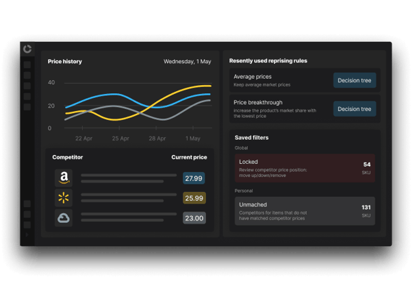
Protect KVI price perception while growing margin
Defend value perception on KVIs while improving profitability across the long tail and adjacent categories.
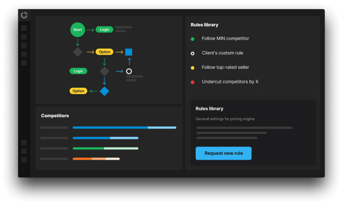
Markdown timing for fresh and perishable categories
Use demand-aware markdown recommendations to recover value before waste escalates and margins disappear.
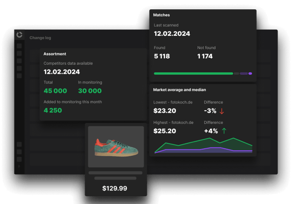
Reduce promotion dependency without losing volume
Replace blanket discounting with pricing actions grounded in demand and elasticity.
HubSpot section family S160AG-L/T
S160AG-L/T | Asymmetric Grid
Designer / legacy aliases:
Case Studies grid; Frame 2610069; S180EM | Editorial MosaicShared asymmetric content-card family for case studies, articles, news, podcasts, glossary entries, campaigns, and other featured editorial content.
Final decision
Editorial Mosaic is not a separate component family because it reuses the same asymmetric layout. Logo Overlay and Text Overlay are controlled section variants using one module and one Content Card component.
S160AG-L/T | Asymmetric GridAdd sectionContained HubSpot modules
M010SH | Section HeadingShared title, description, and optional archive link.M160AG | Asymmetric GridRepeatable cards, featured placement, overlay mode, source mode, and responsive grid geometry.
Nested React UI components / repeater items
U160CC | Content CardImage, tag, title, excerpt, optional logo, result data, metadata, and link.
Figma
S160AG-L / Asymmetric Grid / Logo Overlay; S160AG-T / Asymmetric Grid / Text OverlayHubSpot
sections/S160AG-L-Asymmetric-Grid-Logo-Overlay.hubl.html; sections/S160AG-T-Asymmetric-Grid-Text-Overlay.hubl.htmlCodebase
modules/M160AGAsymmetricGrid; components/U160CCContentCardSearch
asymmetric grid, editorial grid, case studies, resources, articles, podcasts, newsLogo OverlayText OverlayManual/JSON/HubDB/dynamic sourceFeatured card geometry
How grocery retailers price with Competera
Explore success stories of AI-driven pricing solutions for grocery retail

CASE STUDY
Fortune 500 Department Store Boosts Online Revenue by 40%
Explore how a major US-based Fortune 500 department store chain revolutionized its digital retail performance through AI-driven price optimization
Fashion and apparel
CASE STUDY
Leading Supermarket Transforms Pricing Strategy with AI-Powered Automation
This case study examines how NOVUS, a major Ukrainian supermarket chain, partnered with Competera to implement an advanced pricing automation solution.
Grocery
CASE STUDY
Luxury Beauty Retailer Transforms Pricing Across Europe with AI Optimization
Discover how Flaconi, a leading German-based online beauty retailer, transformed its pricing capabilities across multiple European regions using Competera's AI-powered pricing platform. Read the full case study.
Health and beautyPricing insights for grocery retailers
GLOSSARY
Yield Management Pricing
Get the definition of yield pricing. See its use across various industries and understand its importance in pricing strategies
GLOSSARY
Predictive Analytics For Pricing Strategy
Explore the role of predictive analytics and predictive software in predictive pricing
GLOSSARY
Price Level
Read about price level and understand how the price index correlates to the phenomenon
ARTICLE
Retail reinvented: using AI & SAP to optimize pricing, stock, and profits
Competera, an AI-driven pricing and competitive intelligence platform, and NOVUS, a leading grocery retailer in Ukraine, joined SAP for an episode of the DATARetail and WSD Series
Customer stories

CASE STUDY
Fortune 500 retailer transforms pricing
A scalable pricing operating model for enterprise retail.
Department store
CASE STUDY
NOVUS accelerates pricing decisions
AI-powered automation supports faster, more consistent execution.
Grocery
CASE STUDY
Flaconi grows margin and cuts pricing time
Contextual AI helps a beauty retailer scale pricing across regions.
BeautyHubSpot section family S170SP-A/B
S170SP-A/B | Social Proof
Designer / legacy aliases:
S-ACH-01; review strip, logo cloud, results metrics, awardsTrust-building section family combining reviews, logos, measurable results, awards, certifications, and proof statements.
Final decision
Reviews and Results are structurally different section variants but belong to one Social Proof family. Existing reusable Logo Cloud and Metrics Strip modules are composed rather than duplicated.
S170SP-A/B | Social ProofAdd sectionContained HubSpot modules
M170RS | Review StripCompact review-platform pill or badge strip used by the Reviews variant.M170LC | Logo CloudExisting shared logo-scroller module with the Social Proof editor label.M010SH | Section HeadingShared heading used by the Results variant.M110MS | Metrics StripReused quantitative metrics row used by the Results variant.M170SP | Social ProofRepeatable award, certification, analyst, or proof cards.
Nested React UI components / repeater items
U170RB | Review BadgeReview-platform logo, rating, review count, and supporting trust text.U110MC | Metric CardReused metric unit from the Metrics Strip family.U170AC | Award CardAward or certification icon, title, supporting text, and optional link.
Figma
S170SP-A / Social Proof / Reviews; S170SP-B / Social Proof / ResultsHubSpot
sections/S170SP-A-Social-Proof-Reviews.hubl.html; sections/S170SP-B-Social-Proof-Results.hubl.htmlCodebase
modules/M170RSReviewStrip; modules/LogoCloud as M170LC; modules/M110MSMetricsStrip; modules/M170SPSocialProofSearch
social proof, reviews, logo cloud, results, awards, certifications, trustVariant A: ReviewsVariant B: ResultsReusable Metrics StripReusable Logo Cloud












2023 Best Breakthrough Technology
Solution by Vendors in Partnerships
Awards

2024 Best Retail
Insights by Vendors in Partnerships
Awards

2025 Honoree of the Inc. 5000 List of
Fastest-Growing Companies in
America

Representative Vendor in 2024
Market Guide for Retail Pricing &
Markdown Optimization
Trusted by 50+ organizations across the globe



2023 Best Breakthrough Technology
Solution by Vendors in Partnerships
Awards
2024 Best Retail
Insights by Vendors in Partnerships
Awards
2025 Honoree of the Inc. 5000 List of
Fastest-Growing Companies in
America
Representative Vendor in 2024
Market Guide for Retail Pricing &
Markdown Optimization
HubSpot section family S175CB-A/B
S175CB-A/B | CTA Banner
Designer / legacy aliases:
M-CTA, M-CTA-01; S175GC | Gradient CTA; S176VC | Visual CTAReusable conversion banner with shared content and two controlled structures: Standard and Visual.
Final decision
Gradient is a background style, not a separate component family. Both layouts use one CTA Banner module; the Visual variant adds an optional Visual Board. Background style remains a module setting.
S175CB-A/B | CTA BannerAdd sectionContained HubSpot modules
M175CB | CTA BannerEyebrow, heading, description, primary and optional secondary CTA, background style, and optional visual data.
Nested React UI components / repeater items
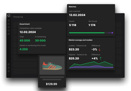
U175VB | Visual BoardExtended dashboard, product, image, or campaign visual used only by the Visual section variant.
Figma
S175CB-A / CTA Banner / Standard; S175CB-B / CTA Banner / VisualHubSpot
sections/S175CB-A-CTA-Banner-Standard.hubl.html; sections/S175CB-B-CTA-Banner-Visual.hubl.htmlCodebase
modules/M175CBCTABanner; components/U175VBVisualBoardSearch
CTA banner, conversion banner, visual CTA, gradient CTA, call to actionVariant A: StandardVariant B: VisualSolid/gradient backgroundCTA enabled/disabled
See what demand-based pricing could recover in your grocery retail portfolio
Most grocery pricing teams are sitting on margin they can't see, locked up in promotions that don't pay for themselves and KVIs priced on instinct instead of elasticity. Book a demo and we'll walk through what that looks like against your own categories.
See what demand-based pricing could recover
HubSpot section family S190FA
S190FA | FAQ Accordion
Designer / legacy aliases:
S-FAQ-01; WideFaqSectionAccessible accordion section for frequently asked questions, product details, implementation notes, or structured disclosure content.
Final decision
The purpose is already general. The existing FAQ implementation is reused with the editor-facing M190FA label; each repeated accordion entry is a FAQ Item.
S190FA | FAQ AccordionAdd sectionContained HubSpot modules
M190FA | FAQ AccordionSection heading, repeatable questions and answers, schema settings, and accessible interaction behavior.
Nested React UI components / repeater items
U190FI | FAQ ItemQuestion, rich-text answer, expanded state, and accessibility bindings.
Figma
S190FA / FAQ Accordion / BaseHubSpot
sections/S190FA-FAQ-Accordion.hubl.htmlCodebase
modules/WideFaqSection with editor label M190FA | FAQ Accordion; nested U190FI itemSearch
FAQ, accordion, questions, disclosure, supportFAQ schemaSingle-item accordionRich-text answers + FAQ schemaAccessible keyboard behavior
Registry summary
Compact cross-system reference for design, development, QA, content operations, and Jira task naming.
| Section template | Contained modules | Nested UI | Search keywords |
|---|---|---|---|
| S100H | Hero | M100HC | Hero ContentM100HV | Hero Visual | — | hero, split hero, centered hero, visual |
| S110MS | Metrics Strip | M110MS | Metrics Strip | U110MC | Metric Card | metrics, KPI, stats, proof |
| S120MG | Media Grid | M010SH | Section HeadingM120MG | Media Grid | U120MC | Media Card | media grid, capabilities, services, cards |
| S130FG-A/B | Feature Grid | M010SH | Section HeadingM130FG | Feature Grid | U130FC | Feature Card | features, benefits, icon cards |
| S140PJ | Pricing Journey | M010SH | Section HeadingM140PJ | Pricing Journey | U140JC | Journey Card | pricing journey, maturity, stages |
| S150AM | Alternating Media | M010SH | Section HeadingM150AM | Alternating Media | U150MR | Media Row | alternating media, zigzag, image and text |
| S160AG-L/T | Asymmetric Grid | M010SH | Section HeadingM160AG | Asymmetric Grid | U160CC | Content Card | case studies, resources, articles, news |
| S170SP-A/B | Social Proof | M170RS | Review StripM170LC | Logo CloudM010SH | Section HeadingM110MS | Metrics StripM170SP | Social Proof | U170RB | Review BadgeU110MC | Metric CardU170AC | Award Card | reviews, logos, results, awards, trust |
| S175CB-A/B | CTA Banner | M175CB | CTA Banner | U175VB | Visual Board | CTA, conversion, gradient, visual |
| S190FA | FAQ Accordion | M190FA | FAQ Accordion | U190FI | FAQ Item | FAQ, accordion, questions |
Implementation rules
Use these rules when creating the actual Figma components, HubSpot section templates, React modules, nested UI components, and content documentation.
HubSpot section labels
- Use
S###XX | General Name, orS###XX-A/B | Variant Namefor approved structural variants. - Section files use the exact registry filename, for example
S120MG-Media-Grid.hubl.html. - The section controls layout and inserts approved modules.
- Content managers should not rebuild the composition from raw modules.
HubSpot module labels
- Use
M###XX | General Name. Shared utility modules may use the reservedM000–M099range. - Keep labels concise enough for the module picker.
- Hide section-only modules with
is_available_for_new_content: false. - Never use reserved field names such as
label.
React and CSS
- Use PascalCase folders such as
M120MGMediaGrid. - Nested items use
U-prefixed component names. - CSS uses a semantic
cmp-namespace. - Do not add translate-up hover movement unless explicitly approved.
Figma and governance
- Use slash-separated paths such as
S120MG / Media Grid / Base. - Record old aliases in the central registry.
- Do not reuse retired IDs.
- Use A/B only for structural variants validated on desktop and mobile.
Trusted by 50+ organizations across the globe